COVID-19 Vaccination
This infographic went with a news article about local vaccination efforts. While designing this infographic, I included information on several different aspects of COVID-19 vaccination to supplement the more limited coverage of the article, making sure to include information at all levels (school, county, state, and country). The color theme is a cohesive gray, red, and blue, since the COVID-19 virus is typically depicted as a gray sphere with red spikes, while the light blue reflects the clinical nature of the vaccine. The most challenging, but also fun, part of designing this was arranging all 6 sections of information so that they fit in a rectanglar area while still maintaining visual appeal.
Industry Standards
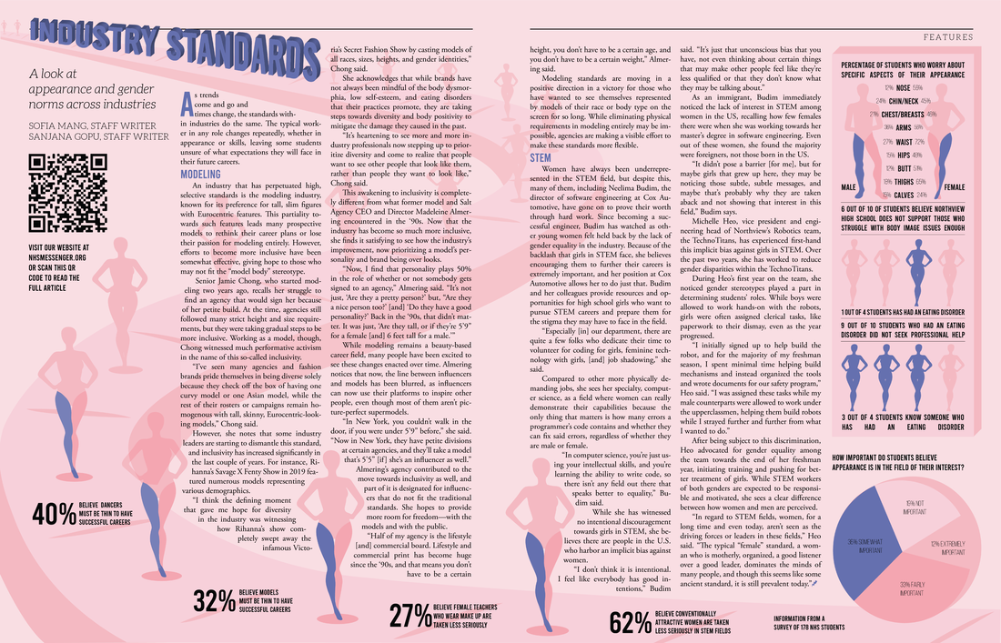
I designed a conveyer belt that is churning out identical models, since modeling is one of the industries discussed in this article, and models are traditionally expected to have almost identical body measurements. The way the conveyer belt stretches from the front of the page far into the distance and the positioning of text with regard to the conveyer belt add depth to the design. I stuck to a blue and pink theme, since the STEM field, according the article, still retains remnants of traditional gender roles, and blue and pink are the traditional colors associated with the male and female genders, respectively. I used variations of Bebas, a very rigid, uniform font, to reflect the often rigid standards that workers must conform to in order to be successful in certain industries. On the right side and at the bottom, I added some school-specific statistcs to complement the content in the article.
The Next Step
I kept this design simple so as to not draw attentation away from the subjects of the article and their stories. I incorporated the seniors' names into the photos to add depth to the design and matched the color of the two spreads to the background color in the photos. The bold and modern font (Franklin Gothic Demi Cond) is meant to convey the seniors' bold ideas and their determination to change the world in the future. I had the photographer take pictures on the stairs in front of the school so that the seniors are sitting on literal 'steps' to match the title "The Next Step."
Tampon Tax
The cover of this news story is a twist on the Monopoly luxury tax square, since period products are taxed as luxury items in many states. Instead of the ring on the original Monopoly board, though, the cover depicts a tampon. I continued with the Monopoly theme for the spread, replacing the names, prices, and other text on the Monopoly squares with period product statisitics. The fonts used closely resemble those on the original Monopoly board, but I decided to use pink instead of the original green, since the 'tampon tax' is often considered a part of the 'pink tax.'
Cracking Under Cultural Expectations
For the cover of this story, I had the photographer take a photo of a hand writing on the mirror with lipstick. I incorporated a cracking effect into the mirror and lipstick on the cover to better reflect the title "Cracking Under Cultural Expectations." I used mirrors throughout the design, since mirrors are closely related to beauty standards and body image. The title font and its color, also used throughout the design, are meant to resemble lipstick writing. I created a lotion-like effect for the pull-out quotes because a few of the interview subjects discussed cultural standards regarding skin and the products they used. I had the photographer take a photo of the interview subjects' quotes written on sticky notes for the last page, since those with body image issues often put positive affirmation sticky notes on mirrors. I chose lilac for the background color, since lilacs traditionally symbolize confidence, an important aspect of the beauty standards discussion; to make the design cohesive, I also used lilac for Kristin's face mask (first spread) and the sticky notes (second spread).
